
Color Combinations to Unlock Endless Outfit Possibilities
In the ever-evolving world of fashion, the art of mastering color combinations remains a timeless skill that can transform the ordinary into the extraordinary, offering an avenue to significantly expand our wardrobe options. As we embrace the fresh energy of 2024, it's the perfect moment to delve into the depths of color theory and the dynamic color wheel—a foundational tool that holds the key to creating visually stunning and cohesive outfits. This exploration into color combinations is not just about adhering to rules but about understanding the principles that allow for personal expression and creativity in fashion. Learning how to combine colors skillfully can create more striking outfit options, enabling us to reinvent our existing wardrobe and discover new pairings that captivate and express our individuality. Moreover, mastering these color techniques empowers us to curate a versatile and vibrant wardrobe without the need for constant new purchases, championing sustainability in our daily fashion choices. By investing time in understanding color theory, we not only save money but also contribute to a more sustainable fashion ecosystem, proving that style and environmental consciousness can go hand in hand.
The Color Wheel: A Designer's Best Friend
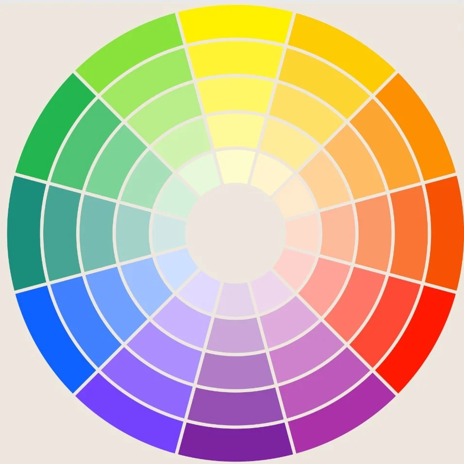
At the heart of color theory lies the color wheel, a vibrant spectrum of colors ranging from primary, secondary, to tertiary hues. Primary colors—red, yellow, and blue—are the building blocks for the entire color spectrum. By mixing these primaries, we get the secondary colors: orange, green, and violet, which in turn blend to form the nuanced tertiary colors, like red-orange and yellow-green. This colorful array is not just a visual tool; it's a roadmap for creating harmony and contrast in fashion.
Crafting Cohesion with Color Combinations
The Boldness of Complementary Colors
Complementary color schemes, which pair opposites on the color wheel, such as red and green, blue and orange, and yellow and purple, create a vibrant contrast that makes each color stand out. The key to mastering this scheme is to use deep or muted tones and to balance the colors in unequal proportions, ensuring one color dominates while the other accentuates. This approach prevents the combination from overwhelming the senses, instead fostering a visually compelling look.
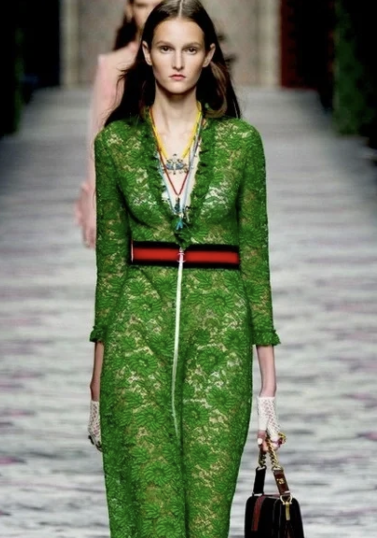
The outfit in the image presents a sophisticated take on the complementary color scheme. The dress, which serves as the centerpiece of the look, is in a muted shade of green with delicate floral detailing, embodying the dominant color in this pairing. It is paired with a contrasting red belt. This red is not bright but rather subdued, ensuring it accentuates without competing for attention. The proportion of red to green is minimal, which aligns with the principle that one color should dominate while the other serves as an accent. This strategic use of color enhances the overall aesthetic appeal of the ensemble, making it vibrant yet harmonious to the viewer's eye.
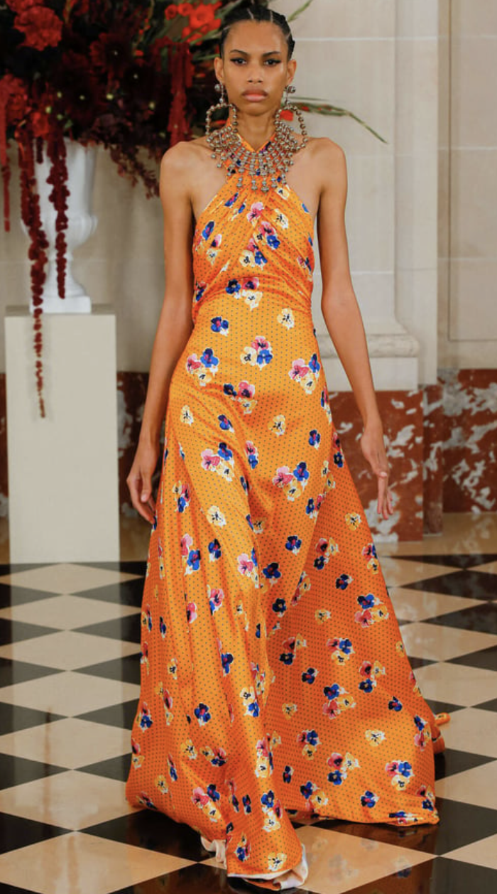
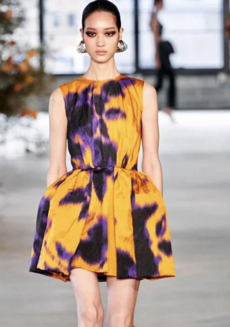
The two dresses exemplify the striking effect of complementary colors within fashion design. The first gown (left) seamlessly integrates an orange base with blue and purple floral accents. This combination of warm orange with cool blue tones illustrates the powerful dynamic of using contrasting colors on the color wheel to create a visually engaging ensemble. The second dress (right) adopts a more abstract approach with a rich, golden-yellow fabric offset by bold patches of purple. The interplay of these hues highlights the complementary relationship between yellow and purple, resulting in a captivating, modern, and impactful look.
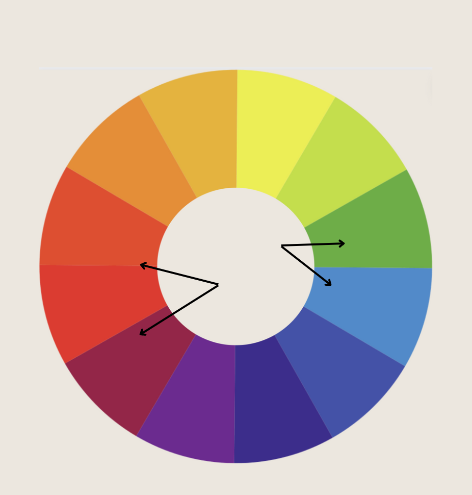
The Elegance of Split-Complementary Colors
The split-complementary scheme is a splendid choice for those seeking a less intense contrast while maintaining visual interest. This scheme involves choosing a base color and pairing it with the two (or one of the two) colors adjacent to its complement. This method offers a harmonious balance with a twist, providing a safer playground for experimenting with color.
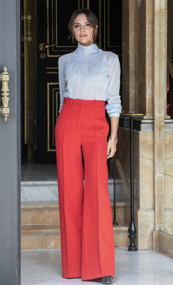


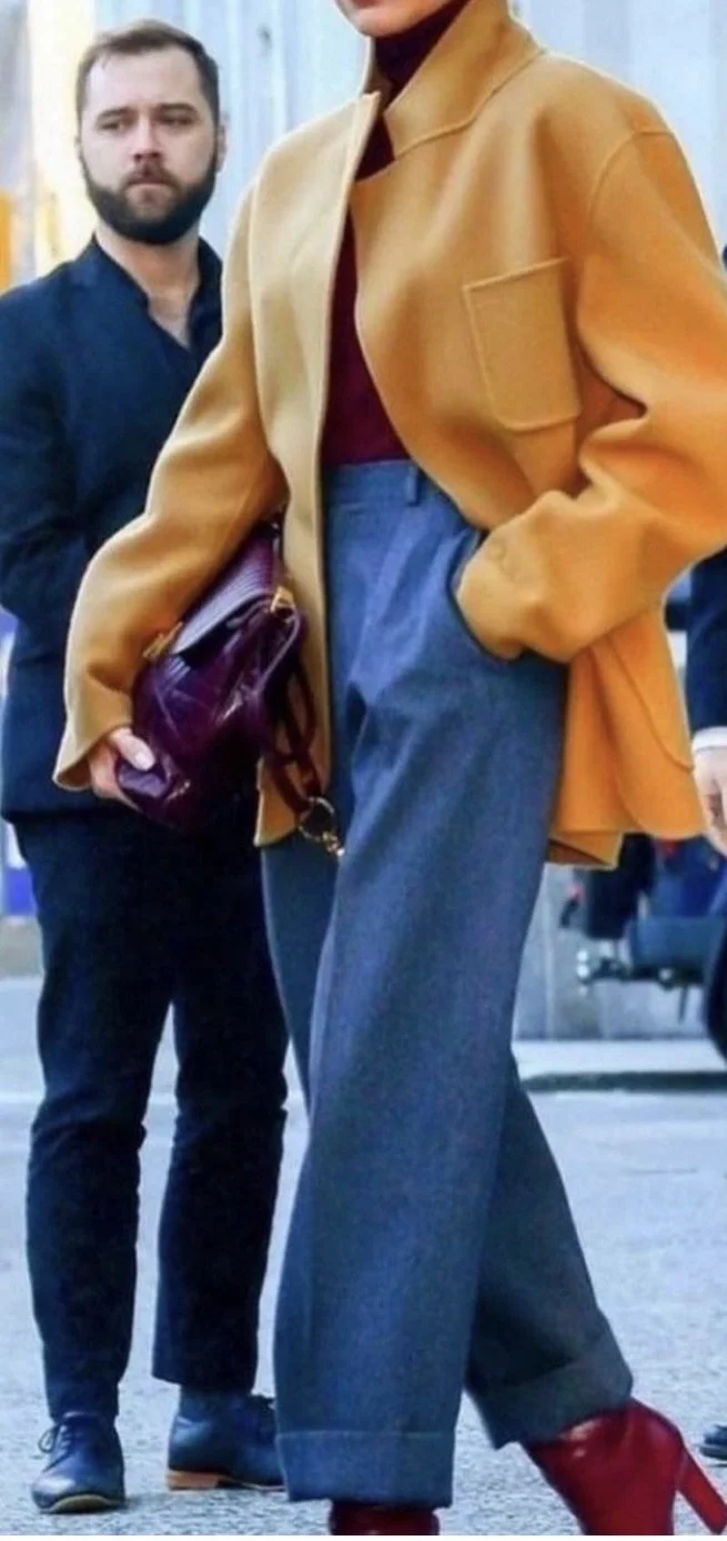
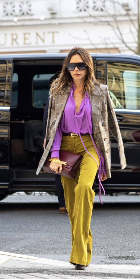
The photos above illustrate the split-complementary color scheme in fashion. In the first image, Victoria Beckham wears a crisp, pale blue blouse that serves as a base color, paired with bold red trousers. The red is complemented by the blue tones of the blouse, which is a split from the red's direct complementary color, green. This variation allows for a striking yet less overwhelming contrast compared to a direct complementary scheme. The photo on the right, features a woman in a red shirt with mustard yellow pants, where the mustard yellow serves as the base, and the red as one of the two adjacent colors to yellow's direct complement, purple. This split-complementary pairing is visually appealing, offering a sophisticated balance that is both dynamic and more subdued than direct complementary combinations.
The Harmony of Analogous Colors
Analogous color schemes resemble nature's palette, where three colors next to each other on the wheel blend seamlessly. This scheme is all about subtlety and sophistication, creating a soothing visual effect that is pleasing to the eye. It is perfect for those who prefer a more understated look but still wish to explore the nuances of color coordination.


These photos illustrate the analogous color scheme principle, showcasing outfits that employ colors adjacent to each other on the color wheel, reflecting the subtle transitions in natural landscapes. The first picture of JLo features a striking combination of a vivid green blouse and navy blue trousers. The green and blue are next to each other on the color wheel, creating a harmonious look that is vibrant yet sophisticated. She completes the ensemble with black accessories—a belt, shoes, and purse—which, according to the "Basic Guidelines for Color Mixing," act as a neutral grounding element, adding depth and contrast without disrupting the color harmony.
In the second image, we see an outfit composed of a rich rust-colored trench coat layered over a deep maroon dress (a dark, brownish-red color). These warm tones sit side by side on the color wheel, blending smoothly to produce an elegant and understated look. The analogous colors create a soft, cohesive appearance.
The Drama of Triadic Colors
For the bold at heart, triadic color schemes offer a daring approach. By selecting three colors that form an equal triangle on the color wheel, such as red, yellow, and blue, this scheme brings an energetic and dynamic vibe to any ensemble. The trick is to let one color dominate and use the others as accents, crafting an outfit that's balanced yet striking.


The two images show a triadic color scheme manifested through different tones. The first photo presents Lupita Nyong wearing a dress that bursts with vibrant, high-saturation tones. Here, a bright mustard yellow coat is the standout piece, complemented by the vivid hues in her dress and the sharp red of her shoes. Each color is pure, clear, and lively, contributing to an overall look full of energy and vivacity.
While using the same red, yellow, and blue triadic base, the second image showcases more muted, rustic tones. The yellow-orange coat carries a deeper, more subdued shade akin to ochre, while the blue pants display a more washed or worn quality, and the red boots have an earthier tone. The less intense, almost vintage shades convey a sophisticated yet understated aesthetic, differing from the lively spirit of the first outfit but still maintaining a cohesive and dynamic color story. Both ensembles successfully balance the triadic color scheme, with one color predominantly leading the palette while the other two serve as complements. Yet, they evoke distinct moods and styles through their choice of tones.
Beyond the Wheel: The Power of Shades
While the color wheel presents the primary shades of each color, the true magic lies in exploring the vast spectrum of shades each hue offers. For instance, instead of sticking to the standard blue and orange, why not soften the look with a light blue and a warm peach? Or, instead of a stark green and red, opt for a muted olive and a deep burgundy. This approach not only expands your color palette but also allows for a more personalized expression of style that can adapt to any season or occasion.

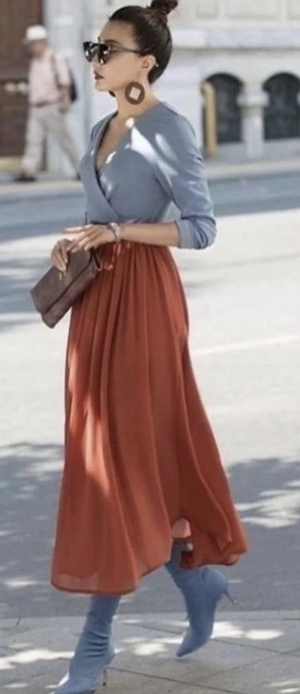

In pictures #1 and #2, we see outfits that are prime examples of the split complementary color scheme. The first outfit features a vibrant blue base color dress adorned with floral patterns incorporating shades of maroon and warm orange, offering a vivid contrast that's full of life. Blue is the primary color, while maroon and orange are split complements, creating a lively and harmonious look.
The second outfit showcases a more muted interpretation of the same scheme. The rust-colored skirt provides a subdued base, paired with a soft blue top and complemented by deep maroon accessories. The rust and maroon are less saturated than the vivid colors of the first outfit, giving the ensemble a softer, more understated elegance while still adhering to the principles of the split complementary color scheme. Both outfits maintain balance and visual interest by skillfully selecting and pairing colors adjacent to the base color's complement on the color wheel.
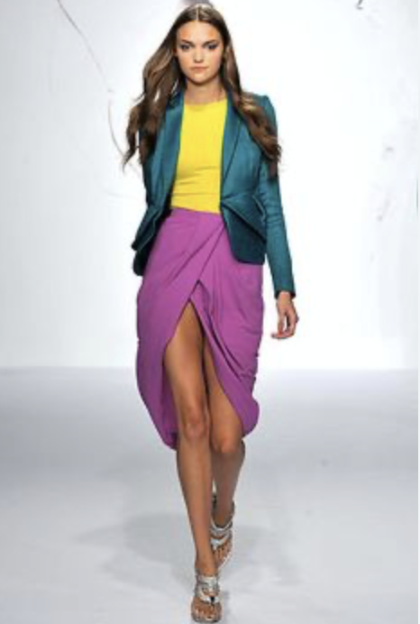
Picture #3 presents a striking outfit example of a triadic color scheme, featuring a teal blazer, yellow top, and purple skirt. These three colors, spaced evenly apart on the color wheel, create a bold and balanced look, with each color standing out while harmonizing with the others.
In picture #4, David Beckham's outfit displays a more subdued but equally effective triadic scheme. He pairs a dark mustard-colored suit, a green turtleneck, and a deep purple scarf. This outfit demonstrates how triadic color schemes can be adapted to various levels of intensity and style, from the vivid and bright to the earthy and muted.
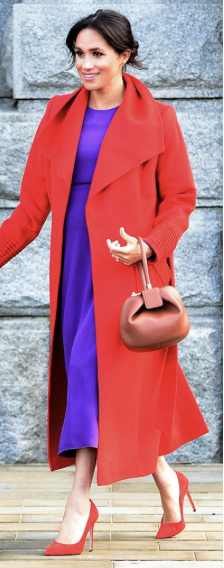
The outfit in picture #5 is an example of an analogous color scheme characterized by the use of colors next to each other on the color wheel. In the first image, Meghan Markle dons a vibrant red coat with a bright purple dress. The handbag and heels in a shade matching the coat create a seamless transition between the colors. This combination of purple and red is harmoniously linked by the red's underlying warm tones, presenting a cohesive and visually appealing look.
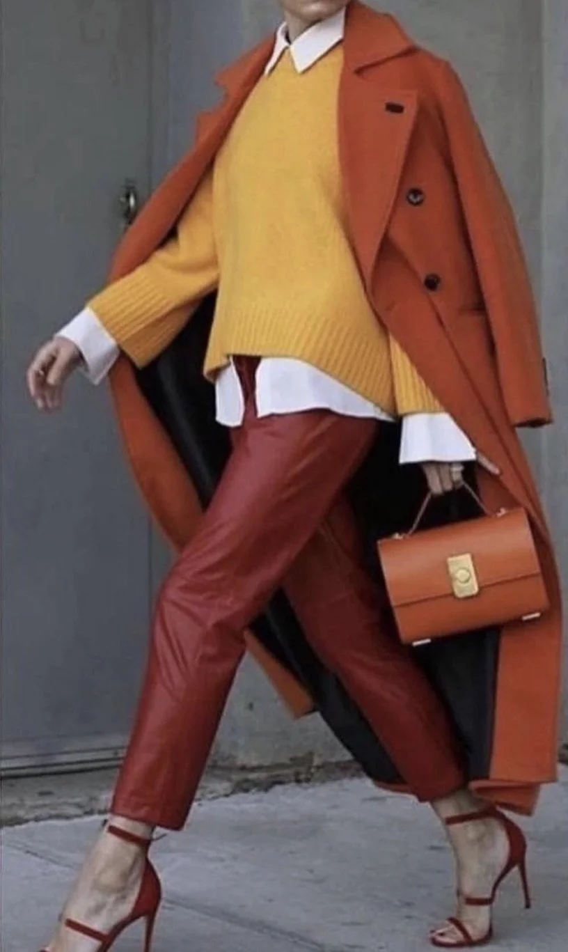
The image in picture #6 shows an outfit with a color palette that includes a rust-colored coat, a mustard yellow sweater, and maroon pants. Here, the analogous color scheme is executed with a progression of warm hues, creating a rich, autumnal vibe. The earthy tones of each piece blend smoothly, giving the ensemble a sophisticated and understated elegance that is both fashionable and timeless.
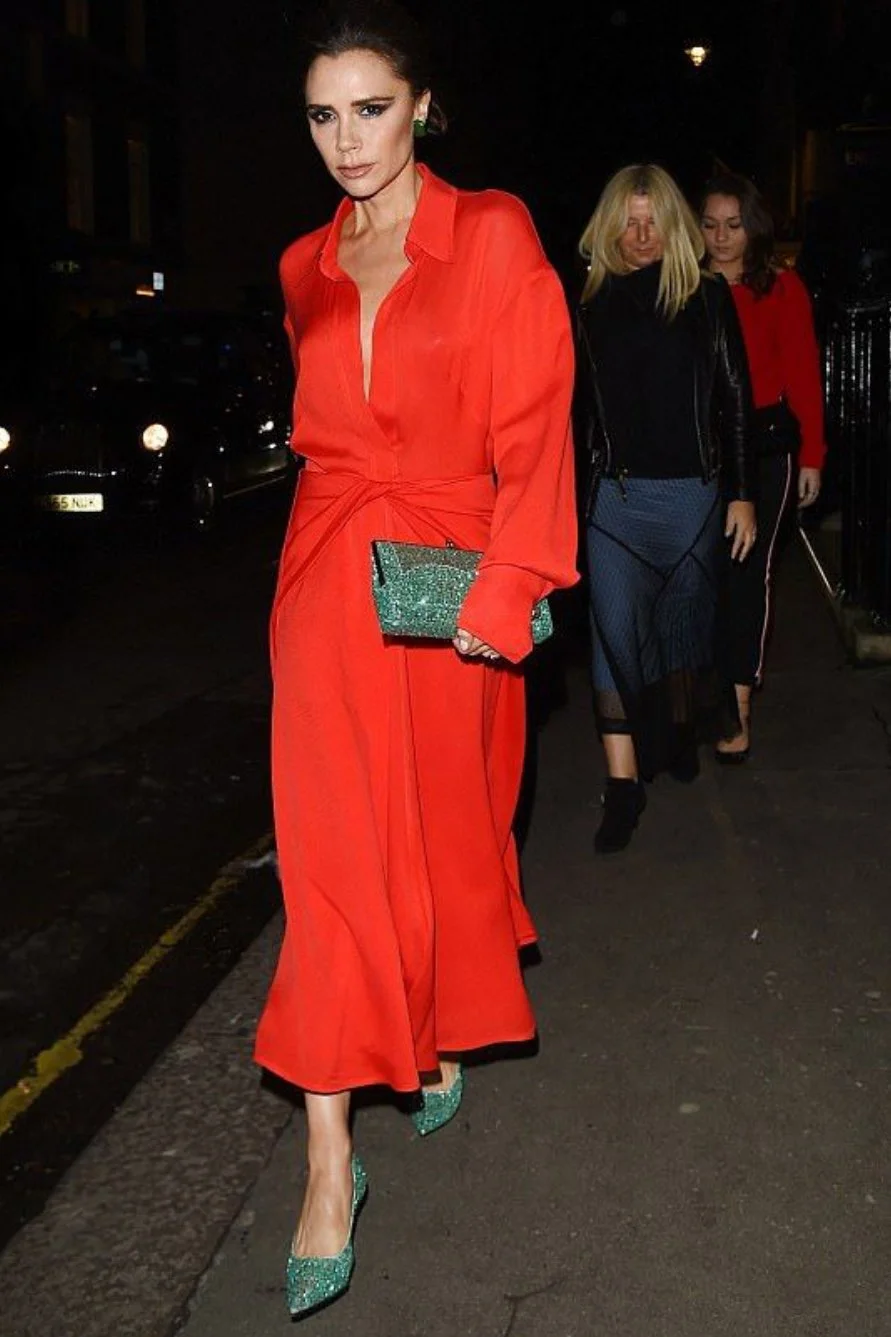
The last two outfits displayed in images #7 and #8 are examples of the complementary color scheme in fashion, where colors opposite each other on the color wheel are paired to create a visually striking effect. In the first image, the vibrant red dress creates a bold statement, which is artfully complemented by the emerald green accessories. This classic red-green pairing is known for its high contrast and mutual enhancement of each color's intensity.
The last outfit employs a similar principle but with a different color pair. The mustard yellow trousers and deep purple blouse are opposite hues, producing a sophisticated and vibrant look when combined. The complementary colors of yellow and purple make each color appear more vivid and dynamic. These outfits demonstrate the enduring appeal of complementary colors, providing an eye-catching and elegant contrast that enlivens the overall look.
In 2024, let's embrace the power of color combinations in fashion with open arms and creative minds. By understanding and experimenting with the principles of the color wheel and the endless shades it inspires, we can craft outfits that look harmonious and resonate with our personalities and style preferences. Remember, fashion is an art form, and with color as our medium, the possibilities are truly limitless. Moreover, a deep understanding of color theory empowers us to remix and match the same garments in new, innovative ways, enhancing the sustainability of our wardrobe by maximizing the versatility of each piece. This mindful approach to fashion not only celebrates personal expression but also contributes to more sustainable and environmentally conscious consumption.