Mastering the Art of Color Mixing in Your Wardrobe
Fashion is not just about the clothes we wear but the stories we tell with each choice. It's a canvas that we paint with our personalities and moods. One of the most expressive tools in this artistic arsenal is color — yet it's often one of the least understood. For many, navigating the color wheel can feel daunting, leading us to stick to the safety of monochrome or neutrals. However, color mixing isn't a confusing art; it's a sustainable and cost-effective approach to creating unique and stylish looks. This guide is for those who wish to delve deeper into the mosaic of their wardrobes and come out with richer, more vibrant combinations.
The Magic of a Linking Accessory
Ask any seasoned stylist, and they will tell you the same thing: the right accessory can make or break an outfit. In the context of color mixing, a linking accessory is priceless. Scarves, necklaces, shoes, and belts are the unsung heroes that can tie your ensemble together seamlessly. For instance, a yellow skirt can be elevated by a vibrant blue and yellow scarf that encompasses both the yellow and another accent color in the same print. The linking accessory should share at least one color with each piece in your outfit. The result? A look that appears thoughtful, well-coordinated, and undeniably chic.
In the picture to the left above, the scarf featuring yellow, blue, and white seamlessly integrates the yellow skirt and white shirt. The blue elements in the scarf serve as a third, accent color, enhancing the overall look.
In the picture on the right, the scarf with leopard print, red, and green colors, pairs perfectly with the red shoes, brown belt, and brown purse to bring the outfit together. Additionally, the green necklace that rests at mid-torso breaks up the white space between the scarf and the pants, adding an extra layer of cohesion to the look.
Guidelines for Color Mixing
Color mixing, like any form of art, has basic principles that can guide you to success.
Choosing a Dominant Color & a Secondary Color: Start with one color that stands out. It is the character leading the narrative of your outfit. This color should resonate with you and anchor the other tones you will introduce. The secondary color should complement the dominant one. Think of it as the supporting actor — it should enhance the primary choice without overshadowing it.
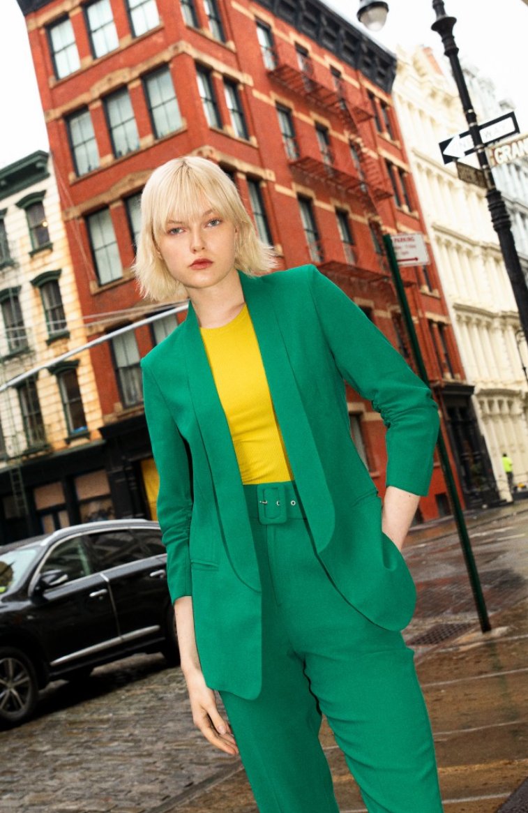
In the picture below, the dominant color is a vibrant green, showcased by the suit the model is wearing. This strong, eye-catching shade of green sets the tone and is the clear focal point of the outfit. It's the lead character in the narrative of the ensemble, drawing the eye and making a bold statement.
The secondary color is the yellow of the model's top. This color complements the green without competing for attention; it serves to enhance the overall look. The yellow is bright enough to hold its own but not so bold as to take away from the green's prominence. The contrast between the two colors adds depth to the outfit and shows a thoughtful approach to color pairing.
Introducing a Tertiary Color Sparingly: Restrict the third color to accents. Too much of it can compete with the others, throwing the balance off. A touch of a tertiary hue in accessories or a single item can add depth to the palette. Refer to images 1 and 2 above for examples of how to incorporate a third color into your outfit using accessories.
Easiest Color Schemes to Adopt: For those taking their first steps into the world of color mixing, here are some accessible combinations that can yield impressive results with relative ease.
Neutrals from Head to Toe: An outfit in shades of khaki, beige, or gray exudes a quiet confidence and timeless appeal. This monotonous palette allows the focus to be on the silhouette and textures, offering a clean, sophisticated look.
The model is dressed in a palette of beige and taupe, which gives the outfit a seamless and elegant appeal. The choice of neutrals here — from the light turtleneck sweater to the tailored beige suit — creates a harmonious and sophisticated look.
By keeping the color palette limited to neutral shades, the outfit achieves a timeless quality. The result is a clean, polished appearance that's versatile and stylish. Accessories like the shoes, with their classic shape and color, complement the outfit without drawing attention away from the overall aesthetic.
Neutral with a Pop of Color: For a slightly bolder statement, pair your neutrals with a bright or metallic color. The pop of color injects energy without overwhelming the eye.
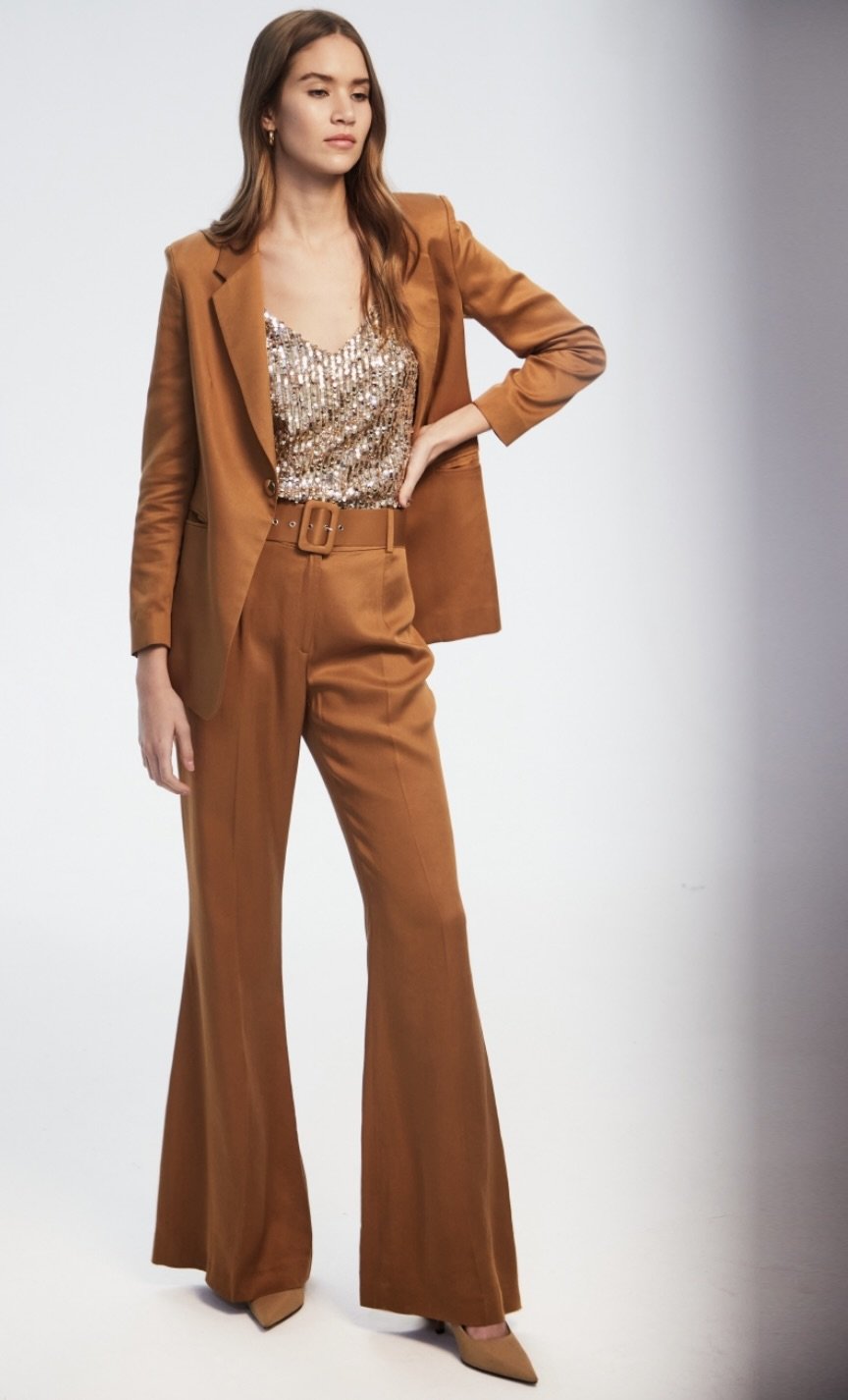
The model is wearing a neutral brown suit; the shimmering gold of the sequined top enlivens the ensemble. It breaks the monochromatic scheme of the suit and draws the eye, becoming the focal point.
The gold sequined top adds a layer of luxury and flair to the otherwise simple and sophisticated brown suit. It's a strategic use of shine and texture that creates a dynamic visual interest. Like with a bright color, the key is not to let the metallic overwhelm the look. Here, it's balanced by the muted tone of the suit, ensuring that the overall effect is of a coordinated and thoughtfully put-together outfit.
Monochromatic Magic: Wearing various shades of a single color is an elegant way to express your style. This monochrome approach highlights the subtle differences in tone and texture, creating an outfit that's both understated and fashion-forward.
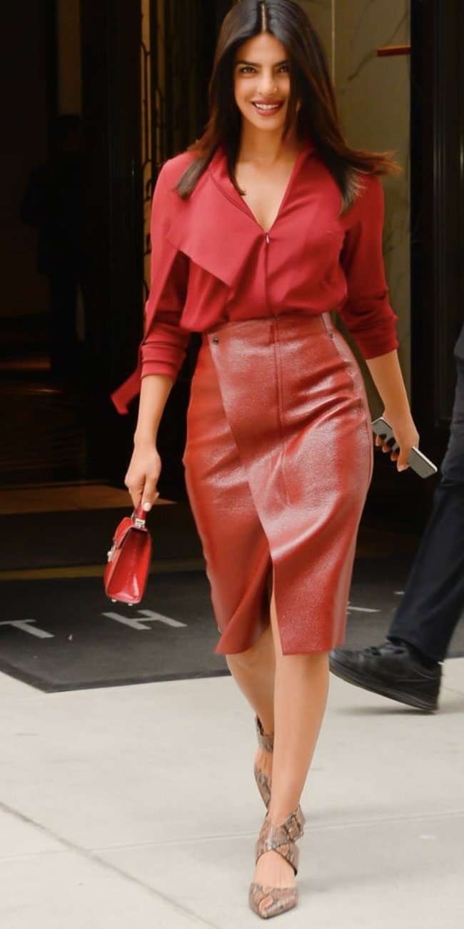
The outfit plays with different tones of red, creating a cohesive and striking look.
The blouse is a softer, muted red, which is a lovely contrast to the more vivid, metallic sheen of the red leather skirt. This contrast in tones adds depth to the outfit and accentuates the textures of the different fabrics. The skirt's glossy finish captures the light and provides a luxurious feel, while the blouse's matte finish adds a touch of sophistication and understatement.
The accessories further emphasize the monochrome theme. The small red handbag matches the hue of the skirt, maintaining the color story and drawing the outfit together. Even the shoes, while not red, have a muted tone that doesn't detract from the red color scheme but complements it due to their understated design.
Pattern Play: Patterns can align with the rules of color mixing when done thoughtfully. Choose a multicolor pattern and match one of its hues with a solid piece from your wardrobe. This technique seamlessly harmonizes the two, preventing the clash that might occur if the pattern is left to its own devices.
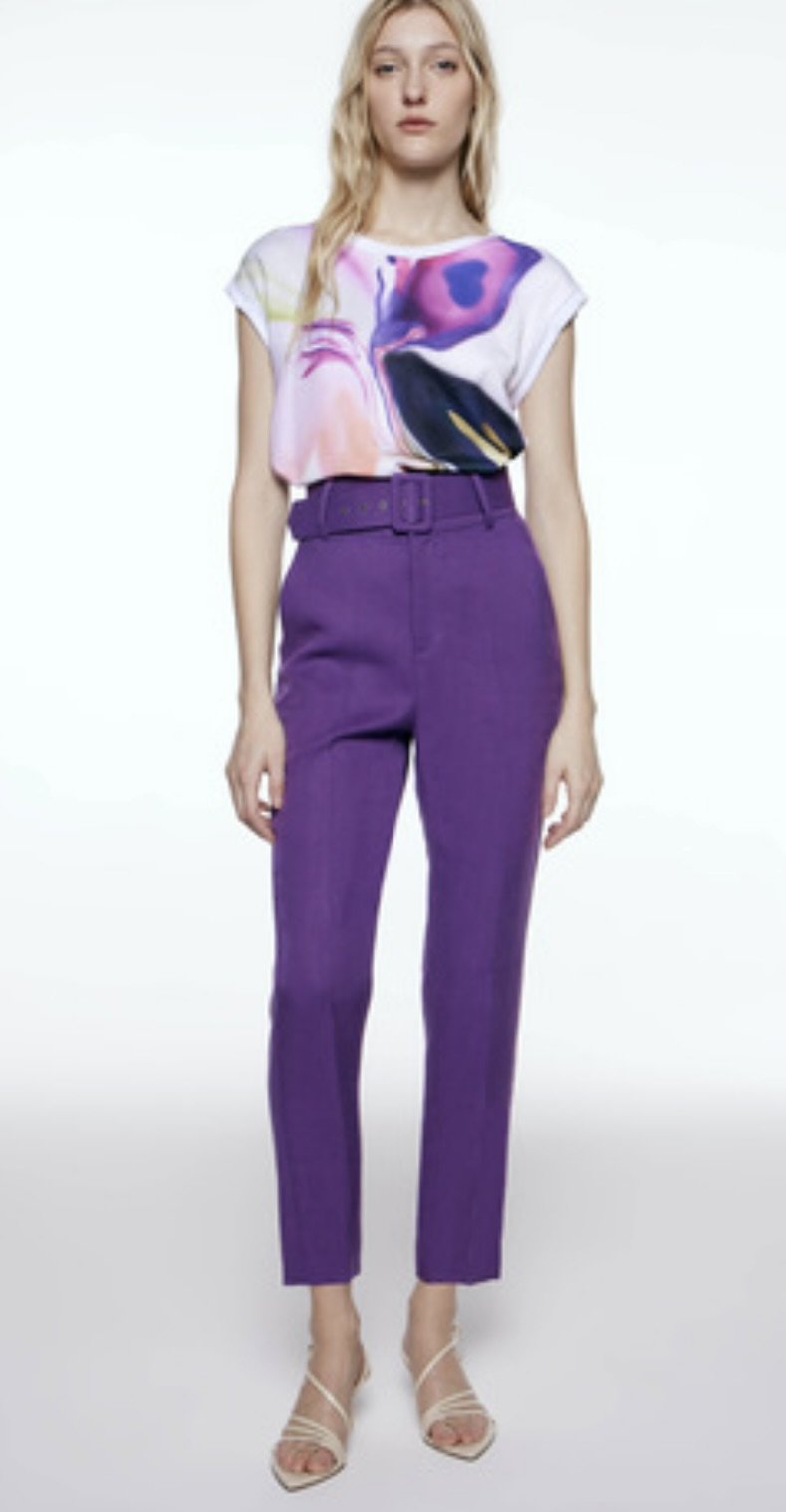
The model is wearing a blouse with a multicolored pattern, which includes a bold hue that matches the solid purple of the trousers. By doing so, the outfit creates a connection between the pattern and the solid color, making the overall look feel cohesive.
The trousers echo one of the prominent colors found in the blouse, which ensures that the trousers complement the blouse rather than compete with it. The result is a balanced and visually appealing ensemble where the pattern becomes a highlight rather than overwhelming the look. This is because the solid color of the trousers acts as a visual anchor, providing a base for the pattern to shine.
Conclusion
Color mixing is a powerful vessel for personal expression in fashion. It allows you to explore your wardrobe in new ways, extracting value from each piece in a sustainable manner. The quality of your color choices echoes the quality of the thought you put into each ensemble. By integrating this approach, your outfits will not only be more visually appealing, but they will also carry with them a narrative of depth and intention. This is the true art of style: not just in what you wear, but in how you wear it.


